UX
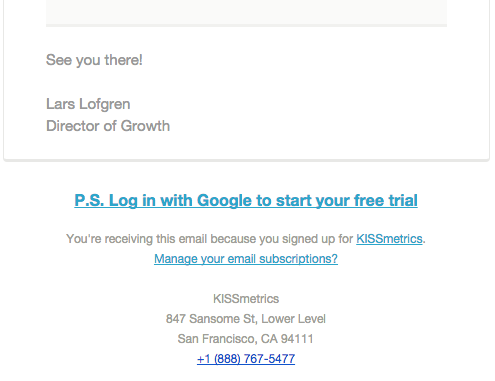
Thank you page
A Thank You landing page is not only to be grateful but also to introduce your new CTA to drive your visitor down, down, down through the funnel!
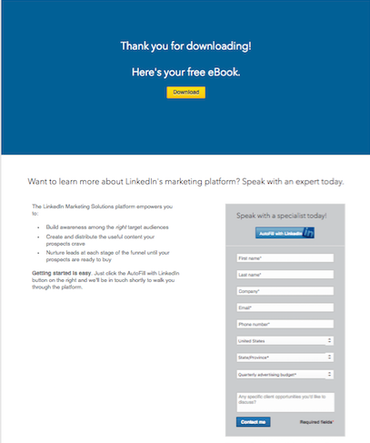
source: bussiness.linkedin.com
Bring your narcissistic self to work
I was recently reading about career development and some guru was suggesting to personify the success in oneself by changing “We did that…” for “I did that…”, “I am leading…” etc.
And today this statement has been confirmed:


Peace and love is for the sixties.
Hope you have a good pair boxing globes for the era of the self.
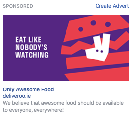
A strong copy is worth a thousand illustrations
If your design resources are constrained, combine your visual with a strong copy.
When being nicer matters more than SEO
Integrity deserves respect.


How to add more keywords to your website
Shopify has built a business encyclopedia to have AAAALLLL the keywords they want to rank for. Why not?
If you want to better rank in the first positions of search engines such as Google, Bing et al, put together a glossary, encyclopedia, FAQ or similar with all the relevant keywords to your business. It might help you achieve it.

Make every channel count
What’s the point in offering the same through every single channel? Would you follow a brand on Social Media and subscribe to their Newsletter if the message delivered is the exact same? Where is the incremental value added?
If you want more subscribers to your Newsletter offer something that your customer can’t access through any other channel.
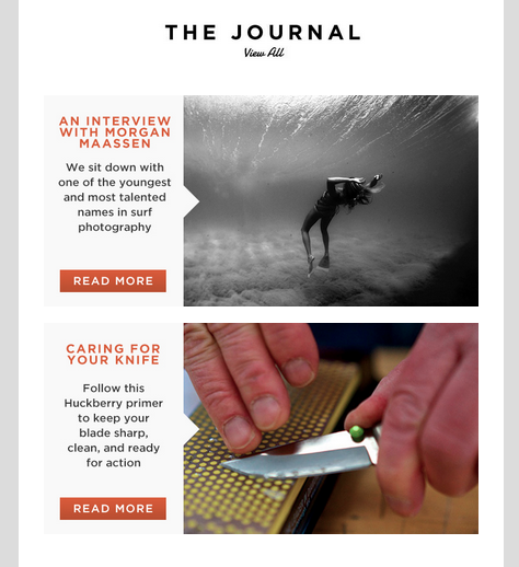
source: https://huckberry.com/
Anatomy of the perfect promotional email.
How does the perfect promotional email look like? Let’s take a look to the best part of the emails I usually receive and put them all together.
SENDER
There are a few options:
- name surname
- name and name
- name from brand
- brand
- name, brand
- team brand
As a rule of thumb, better a person than a brand or a team to give your brand a human touch. A combination of person and brand would be the best option.
If you use a name, it should be familiar to the receiver. Don’t use Mohamed for Central America or Maria Eugenia for Asia.
By adding a picture, your reader would almost believe there is just a person sending an email to another person.
Avoid using no-reply email addresses. What are we? people, right? Let your customer answer your emails for an optimal user experience. Maybe this is not the best option operationally speaking, but you need to evaluate how many customers actually reply, the value of these responses, and the incremental resources you put into attending those answers. If all the above-mentioned is in order, let them answer.
SUBJECT LINE
Use a maximum of 50 characters.
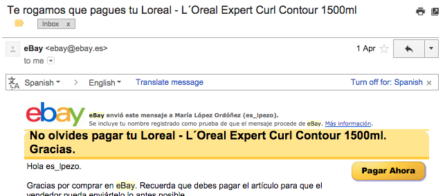
Avoid salesy words like free, % off, reminder.
Include some exclusivity by adding expressions such as early access or pre-order. We all want to be the first.
If you are segmenting your audience, include it on your subject line: localisation or items which differentiate your receiver from the rest.
Use compelling sentences, but don’t trade off creativity for coherence: if you are too cryptic and there is no match with the email content, you will see a drop in the email clicks.
Call to action in the subject line, what could be better? Who cares about open ratio if you can convert since the very beginning?
Be aware that some platforms like MailChimp are offering subject line performance. More and more, email marketing platforms are acting as advisors and improving your performance.
A nice study of effective subject lines.
FIRST WORDS
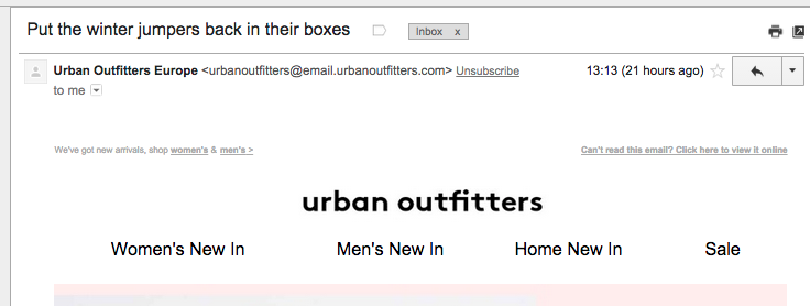
Your very first words on an email cannot be View it in your browser because in some email clients these words will be displayed as a second subject line in the inbox. You need a compelling sentence, it could even be a call to action!
Normally in the preheader of the email you can find the second subject line alongside the View in browser option. You need to place this option there because if the HTML is not displayed properly, you give the reader the chance of viewing in the browser. Some brands place this option in the footer but, If your email looks awkward, do you think they are going to scroll down until the end?
GREETINGS
If you are saying Hello, say it the way you would do it personally. Including the name is a plus, even though we all know that you are not typing it manually.
CONTENT
The only thing you need to consider when writing the content of your email is that you are prompting them to take an action. Everything is about them doing what you want. All the content revolves around the CTA(s). Make sure you include the CTA above the fold, and of course, if the email is long you can repeat it more than once creating a sense of urgency.
Structure the information: use bullet points, highlight the keywords. People don’t read, they skim. Direct the reader to the relevant information.
In terms of content, there is another school of thought (Inbound Marketing) which is about making your emails less salesy, offering in them great pieces of content. It is about converting your salesy email into a newsletter, an article, or any piece of content your customers value, diluting the borders between information and advertisement. Some examples are a journal, pictures of our community, or plans to do over the weekend.
And even if your email is a newsletter per se, you can add a CTA anyway to drive conversion, but in an elegant way, because you are sending a newsletter and the reader is expecting content, not you being pushy.
SIGNATURE
Include an eye-catching signature. Many brands use a play on words in their signatures. And again, say goodbye the way you would say goodbye to a friend.
SOCIAL
Including your social media channels makes your brand trustworthy and drive micro-conversions: if your reader is not ready to buy, they might check your social accounts and like a post, comment on it, follow you or share, or save your content.
If the content of your email is interesting, what about adding forward to a friend and sharing buttons?
If you are adding sharing buttons do not forget to pre-populate a compelling tweet including your handle, post on facebook or any message you share on your social channels.
FOOTER
Unsubscribe option is mandatory. But don’t panic, you can always offer the option for them to manage their email frequency. A weekly or monthly email is better than an unsubscribe.
![]()
Include resourceful links in your emails, in case the reader needs help. Customer care, How it works, Help center. It demonstrates that you care about them and again, those links legitimize your brand because you tell them that you have the resources to help in case they need it.
By subscribing, I accept the data processing indicated in the privacy policy. – Unsubscribe anytime.
© 2021 malo and company, SA made with love Barcelona, Spain by vivid digital


